Projecting emotions: Mercator and Equal Earth

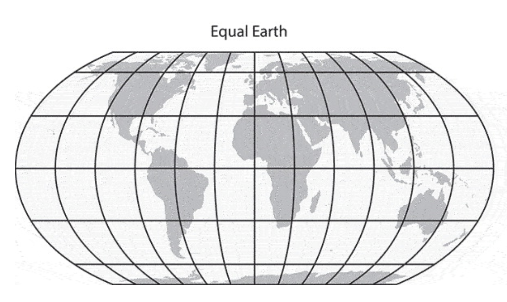
Last week the United Nations General Assembly voted to institute the Equal Earth projection system as the basis for the default world map, following a campaign by Togo and other African nations. Although in the news now, this campaign has long been backed by other African Union countries, and many in the world of cartography. Projection systems are the mathematical processes which convert the surface of the spherical earth into a flat map for display on paper, or indeed a screen. Equal Earth replaces the 450 year old go-to Mercator projection.

Mercator is the ubiquitous cylindrical map visualisation which “stretches” the higher latitudes and shrinks those of the equatorial regions. Cut an orange into eight wedges, lay the eight pieces of peel side by side, then stretch the points out to meet at the top at the bottom, and you get the idea. The benefit of this projection – and the reason why it has been the go-to for 450 years – is that it conformal, i.e. it preserves the relative angles between set points. So if you wish to get from Southampton to New York, Mercator will provide the degrees of the angle between them, and thus the compass bearing you need. At the same time though, this stretching distorts surface area. In particular, it diminishes the relative sizes of mid-latitude zones like Africa and Australia, putting them on a visual par with North America. This is wrong: North America would, in fact, fit into either continent several times over.

This issue forms an important part of my teaching on spatial humanities and the history of cartography. One of my favourite resources is truesize.net, a Mercator world map where you can drag the outlines of countries around and compare their actual surface areas, overlaying them on each other. Dragging Australia on to Greenland and showing that it is at least five time times its size guarantees one of those pleasing moments when undergraduates actually gasp.
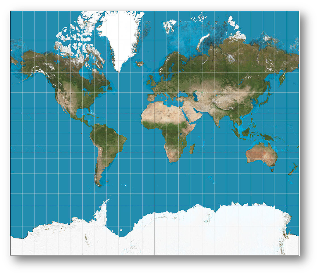
The familiar Mercator projection
The Equal Earth projection. From Bojan Šavrič et al [1].

The Equal Earth projection “fixes” this, by expanding the mid-latitude surfaces areas of the globe so that they are in relatively better proportion with the high latitudes. The quotation marks are important, and will be explained shortly.

Mercator inevitably led to accusations that by diminishing Africa, it reinforced colonial worldviews. This is an old argument. A memorable 2001 episode of the West Wing has the “Organization of Cartographers for Social Equality” (surely there can be no other sort of cartographer?) come in to the White House on “Big Block of Cheese Day”, to urge C. J. Cregg to replace Mercator with the alternative Gall Peters projection, due to the former’s colonial roots (Gall Peters regularises the latitudinal parallels, “stretching” the mid latitudes). But the story is very, very much older than that. Mercator was first popularised in the European so-called “age of exploration” by cartographers pioneering in the new media of mass printing, and making maps for an society that was heavily involved in exploration, long distance commerce and colonization. Abraham Ortelius, for example, used the projection in his Theatrum Orbis Terrarum, including as a means of visualising familiar historical entities such as the Roman Empire and the lands of the Bible (below).
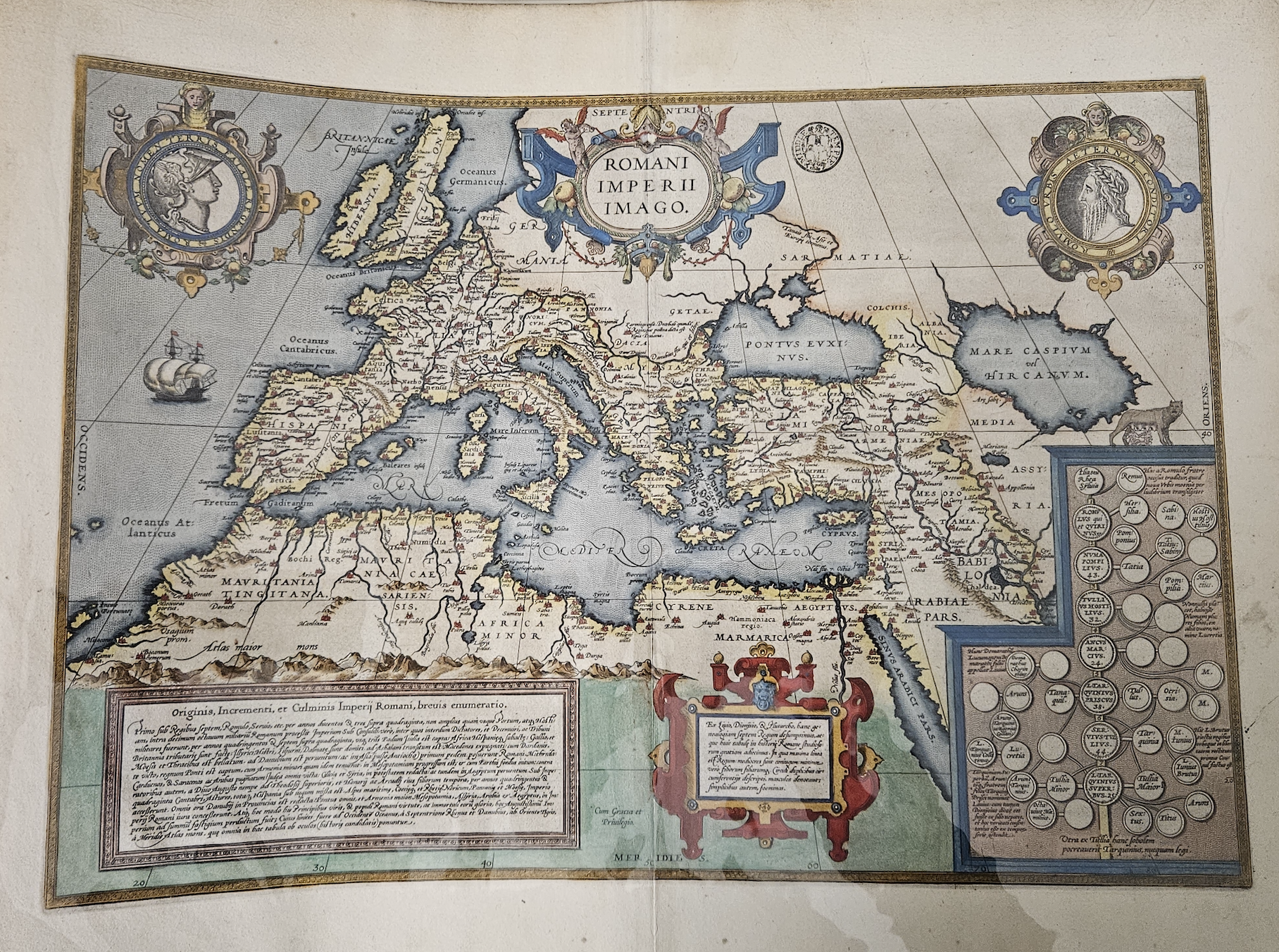
Abraham Ortelius’s map of the Roman Empire, c. 1570

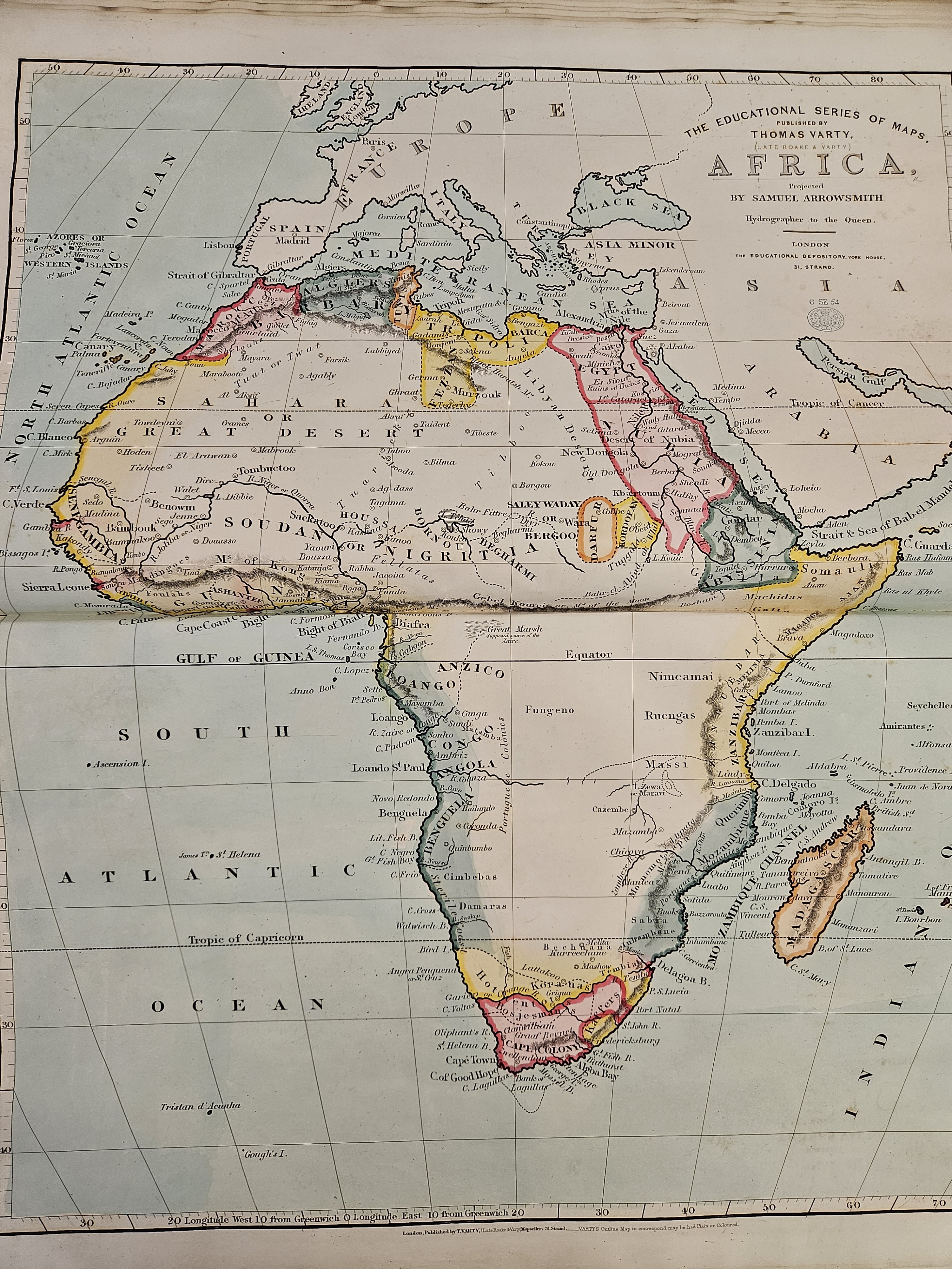
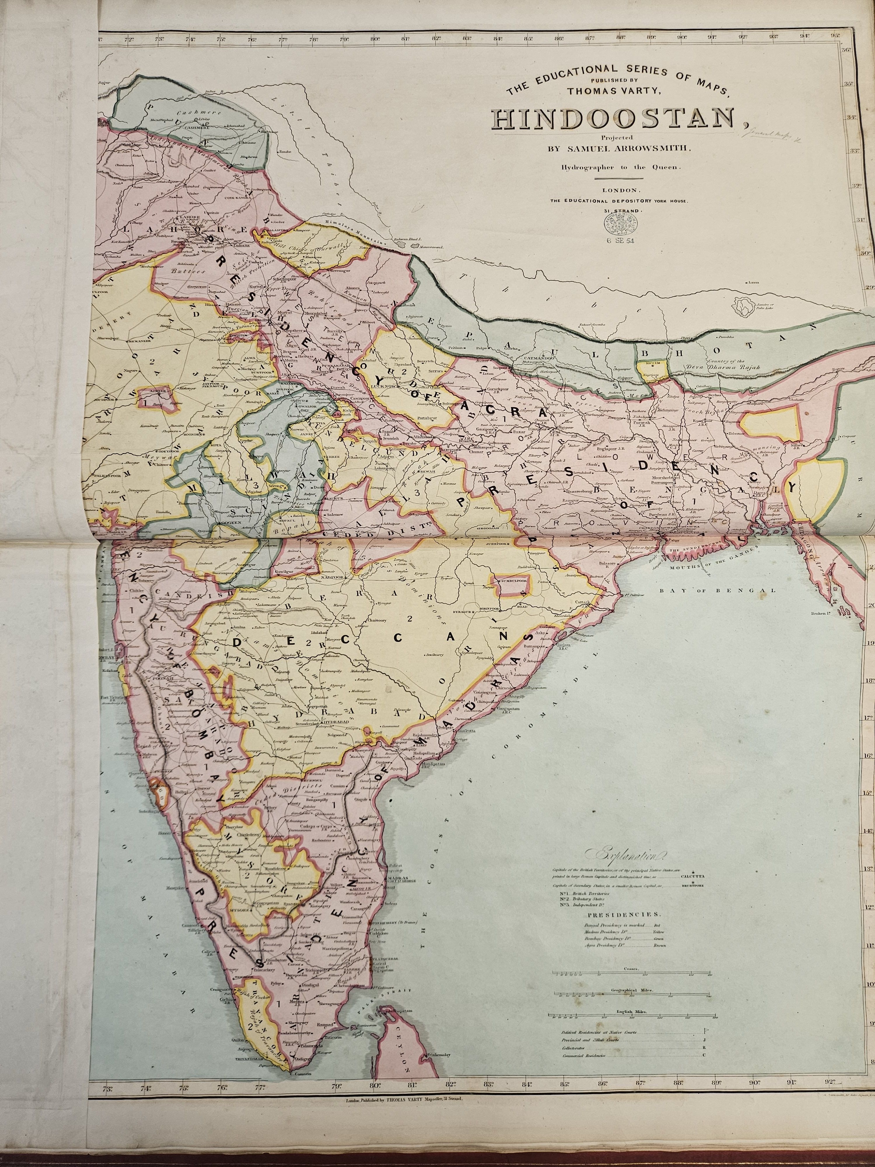
Such entities did not need to include the continents of India or (mostly) Africa. The relevant positions of, say, Rome and Carthage or Athens and Sparta were much more important for the map’s readers. The Mercator projection was never intended to be diminishing or exclusionary, it simply reflected the historical preoccupations and worldviews of both historians and cartographers, while fulfilling navigational functions – reinforcing the former by doing the latter effectively. In later centuries however, as the world became ever more connected and as formal education became more widespread (there is a huge canon of Victorian classroom maps and atlases), the Mercator projection provided an increasingly familiar outline on which educated mapmakers began to hang their understanding of the wider world in which they lived. The two examples below, from Thomas Varty’s Series of Educational Maps from 1850, are examples of this. They show Africa as a terra incognita, with large white spaces covering the interior.
On the other hand, and from this same British perspective, India (or rather “Hindoostan”) is populated with cities, rivers, provinces, railways, infrastructure etc. You map what you know, the British certainly knew India at this time, and and Mercator was the container for that knowledge.
Equal Earth certainly goes some way to addressing the historic visual imbalance this created. However, and I will no doubt not be the only person to point out, it is not a “correct” or “accurate” visualisation, or even a “complete” one – no projection is. It is a set of mathematical abstractions and compromises which renders visible what is otherwise too huge to be visible. In that process, some combination of data – be it angles, surface area or symbology – will always be compromised. While the UN vote re-surfaces this debate and brings the matter back to public attention, Equal Earth is certainly not a panacea — a fact fully recognised by the authors of the paper in which it was originally proposed[1].

As with most things, the digital age has forced a further rethink, and on this I have one small quibble with the Equal Earth paper. In it, the authors state that web maps “are not designed to visualize the entire globe”. Well – in theory they are. The whole thing about web maps is that technically they place the entire globe in your pocket, allowing you to navigate, zoom, search and capture any piece of data pinned to any point on the earth’s surface using the Mercator supported referencing system that most of the big web maps (Google, Bing, Microsoft etc) use. It would be more accurate, I think, to say that the World Wide Web itself was not designed to visualise the globe, it was designed to link pieces of data together in a recognisable and navigable way. The Mercator projection was designed to link places together in a recognisable and navigable way – in the latter case quite literarily. In a digital world where places become data, it is easy to see the parallel. We have just plonked Mercator’s visualisation on top of our data systems out of pure convenience, just as the Victorians did when they were mapping the Empires of the nineteenth century. Mercator allowed you to navigate a journey from A to B, and the visualisation was only ever a secondary consideration to that task. Yet it came to condition the (visual) world view of millions, and to create international and intercontinental visual biases. Thanks to our insatiable desire for convenience, the WWW turbo charged these biases, and the UN has only just moved towards correcting them.

The moral of this story is that the idea that there can be only one form of map projection, whether that is Mercator, Equal Earth, Gall Peters, or any of the others, is not even a twentieth century idea, it is a nineteenth century one, or even earlier. Hopefully the UN vote will enable us to think more critically about what maps are for, how they relate to data, and whether the WWW, the defining infrastructure of the digital age, is really best served by a 450 year old map projection framework.

[1] Šavrič, B., Patterson, T. and Jenny, B., 2019. The equal earth map projection. International Journal of Geographical Information Science33(3), pp.454-465.

Great Lakes, Gulfs and Mountains: rethinking the “stability” of toponyms

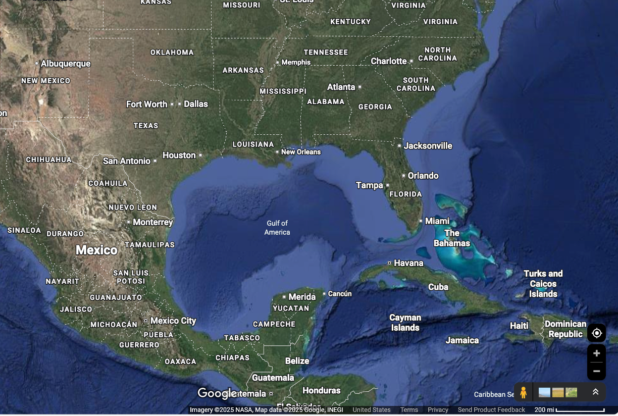
Toponyms were in the news again last week, with President Donald Trump’s pithily titled Executive Order, “Honoring the American History of the Great Lakes and Renaming Lake Ontario as Lake America”, as a somewhat idiosyncratic escalation of a wider trade dispute between the United States and Canada over tariffs. It recalls Trump’s similar Order of January 2025, “Restoring Names that Honor American Greatness”, whose most notable provision at the time was renaming the Gulf of Mexico as the Gulf of America. Famously there was controversy when Google Maps opted to conform to this order for users inside the US (see below), leading to objections from Mexico. And when the Associated Press refused to similarly toe the line, their access to White House was limited.

The Lake Ontario controversy is a glaringly obvious example of toponyms (or, to reference the Prime Minster of Canada’s response, more properly a hydronym in this case) being politically co-opted. Trump’s interventions in toponymy are unusual, not because they change or update toponyms for political reasons, but rather because of their alignment with a visceral and populist political narrative.  This is a fascinating departure from the way in which toponyms have historically been documented, updated or changed for the purposes of political or administrative control.  Careful surveys by trained sappers, the laying out of base lines, surveyors questioning local worthies as to the spelling and dialect of what Feature X has been known as since time immemorial; the transcription, projection and careful design of cadastral layouts and sybmologies in dusty Offices of Surveys etc… that is the path familiar to historical geographers; not the stroke of a presidential pen. An illuminating March 2025 blogpost by Violet Fox, a Cataloging and Metadata Librarian at Northwestern University’s Galter Health Sciences Library, following the Gulf of America renaming, notes the extraordinary speed at which this change appeared in the official vocabularies of the Library of Congress. Fox writes:

Although the special list was backdated to February 13th, no one was notified of these revision proposals until the morning of February 18th, and the deadline for submitting comments was the same day, February 18th. This meant that catalogers had less than 24 hours to respond to these proposals, and our international colleagues in earlier time zones had no opportunity to respond to these proposals.

Fox suggests that the cause of this unprecedented haste was “anticipatory obedience”, an inclination on the part of institutions “describing actions aligning with perceived expectations before explicit directives are given”.  I think this is true; but my point here is the historical development of documented toponyms are all about the incremental evolution of such expectations over time.  Normally, the process of organisation, documentation, and establishing the authority vested of the bureaucratic record is played out over years. In fact, Trump’s 2025 order makes a provision which received less coverage, but which illustrates this more familiar territory (pun intended) well.  North America’s highest mountain, Mt McKinley in Alaska, is named for the US President of the same name, assassinated in 1901. Mt McKinley is also known as “Denali”, a toponym derived from a Indigenous Koyukon term, which was federally recognised in the GNIS in 2015 by the Obama adminsitration.  The 2025 presidential order states:

Within 30 days of the date of this order, the Secretary of the Interior shall, consistent with 43 U.S.C. 364 through 364f, reinstate the name “Mount McKinley.” The Secretary shall subsequently update the Geographic Names Information System (GNIS) to reflect the renaming and reinstatement of Mount McKinley. The national park area surrounding Mount McKinley shall retain the name Denali National Park and Preserve.

This is, in some ways, a much more familiar and well rehearsed playing out of historic toponym disputes: two (in this case) variations of names for the same feature or place, both historically grounded, both culturally and politically charged, with different sources of authority claiming “correctness” in each case. Any historical geographer would recognise this scenario. Trump’s orders however directed the Secretary of the Interior to update the Geographic Names Information System (GNIS), the Federal Government’s official gazetteer of US toponyms with completely new names, literally overnight.  So how can the Lake Ontario/Gulf of Mexico orders be seen from a broader perspective of historical-geographic method?

Asking this question gives me the opportunity to trail a forthcoming paper I have coming out in a festschrift for my old friend and mentor Professor Charlotte Roueche, Tall edifices supported by strong foundations: open data in ancient and Byzantine studies, edited by Gabriel Bodard and Valeria Vitale. Fittingly, even necessarily, the volume will be available in Open Access. This paper, entitled “Engraving the soil: The challenges of defining spatial footprints in Cypriot cultural heritage” concerns the co-option of toponyms for political/colonial purposes in the history of Cyprus.  It is a reflection on the Heritage Gazetteer of Cyprus, a project that I ran with colleagues at King’s including, primus inter pares, Charlotte herself.  I have blogged about this project in the distant past – here and here. Cypriot toponyms are especially interesting because they exist in an historically contested and multilingual environment, with most places being known by both Cypriot Greek and Cypriot Turkish name variations. These variations are inevitably a source of disagreement both inside and outside officialdom: the very first OpenStreetMap “edit war” concerned a Northern Cypriot village with the Turkish name Ozanköy and the Greek name Kazaphani.  The dispute concerned which of these names should be the “primary” one, the one presented to OpenStreetMap users as the name by which the village is generally known.  This inevitably introduces questions, such as what do “primarily” and “generally” mean, and “known to whom”? “The digital” introduces the capacity for conflict, as well as an instinct to reduce contested names to one “correct” form, whilst doing nothing to resolve the actual question of correctness. In the paper, I attempt to describe how networked modelling of toponyms using agnostic line strings to represent different variations can surface and visualise different representations, including competing ones. This at least allows us to consider what “correct” might mean in different contexts. Specifically, I argue that

The given name of a place in use at any one time has different textual witnesses across different textual sources. A toponym is never just a single name, it is a network of different versions of multiple names.

Where this network is hidden, whether by accident or design, toponyms exhibit what historians of cartography call “ontological stability”.  An “official” version of ontological stability for Cypriot toponyms was provided by Herbert Horatio Kitchener’s Complete Trigonometrical Survey of the island, which provided an “authoritative” (and extremely accurate, by modern scientific standards)  overview of the island, and the spellings of its toponymic variations:

Kitchener represents a datafication of observable reality, simultaneously containing and encoding all the ambiguities that human observation entails. In doing so, it negates ambiguity, presenting a univocal view of the world.

While Kitchener’s map provided ontological stability for the island in 1885, it was nonetheless fragile; of utility primarily as a means of taxation, administration, census and military deployment. It was not a map widely, if at all, recognised by the Greek or Turkish Cypriot inhabitants of the island, unless forced to do so through interaction with governmental authority. I argue that the map was politically legitimate as far as its own purposes went, but at the same time was ontologically unstable.

So what sort of ontological stability might “Lake America” and indeed the “Gulf of Mexico” now enjoy?  In the paper I go on to say:

[I]n the context of places with historically documented names (which includes physical features and settlements in existence long before their names were documented in written records), gazetteers in fact highlight toponyms’ lack of such stability

In other words, place naming is, and always has been, an exercise in bureaucratic process, documentation and direction, and thus control.  As the case of Cyprus shows, you write toponyms down in official lists, providing a “univocal view of the world”, only if you have reason to do so. Those reasons are always to do with the authority to do something to or with the territory being named.

I believe these two cases of modern place-renaming highlight a very important point: “ontological stability” is certainly not just a product of linguistic, textual or cultural disagreement about a particular toponym. It can also be introduced through direct political intervention, for clear political ends.  And this shows that there is surely a splendid irony in a US administration which bases its entire narrative on overthrowing old orders of establishment and bureaucracy putting out eye-catching ventures into toponymy which riff on three hundred plus years of establishment and bureaucracy.

The Eye of History

I’ve been spending time in the map room of the British Library recently, trying to understand the main historical points to do with the emergence of modern “scientific” map-making in Europe. Maps are physically unwieldy, and their unwieldiness is an important, yet sometimes overlooked aspect in this history.

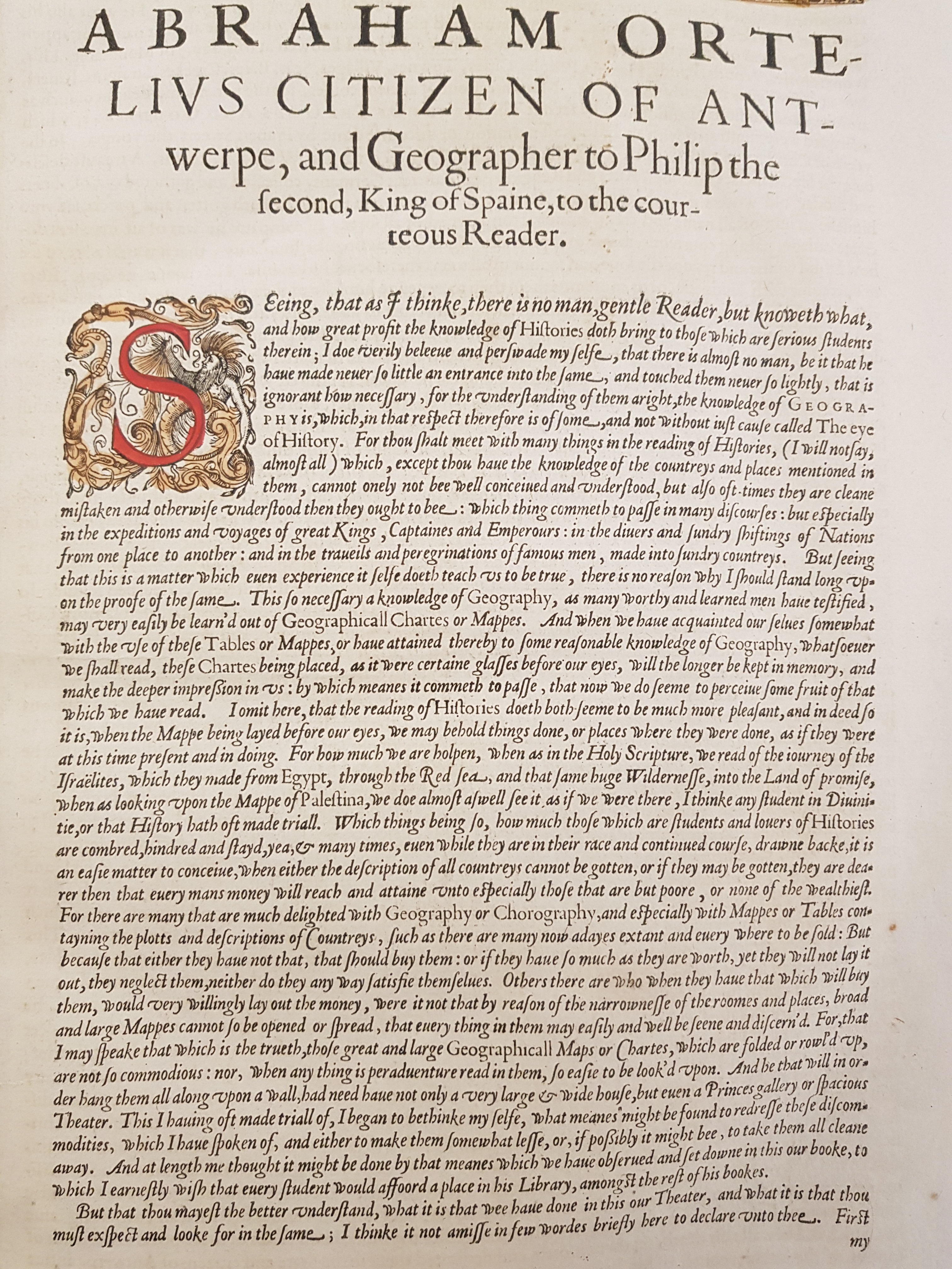
20180110_101925

This rather fine folio from the English edition of Abraham Ortelius’s  Theatrum Orbis Terarum – the first atlas – for example, gives us an insight into his thinking about why, in 1570, he had had this new-fangled idea of putting a collection of maps together into a book:

“There are many”, Ortelius says, “that are much delighted with Geography or Chorography, and especially with Mappes or Tables containing the Plotts and Descriptions of Countreys, such as there are many now adayes extant and everywhere to be Sold, But because they have either not that, that should buy them, or if they have so much as they are worth, yet they neglect them, neither do they anyway satisfy them”.

In other words, only the very wealthy could afford the maps on which the far-flung New World was being recorded at this time, and the gentlefolk of sixteenth century Antwerp were either too poor, or too mean, to buy them.

Ortelius goes on:

“Others there are who when they have that which will but them would very willingly lay out the money, were it not by reason of the narrownesse of the Roomes and places, broad and large Mappes cannot be so open’d or spread so that everything in them may be easily and well be seen and disceren’d”.

Maps, in other words, were simply too big for people’s houses.

This preamble gives a nice insight into Ortelius’s motivation for inventing the atlas, while at the same time providing a snapshot of early publisher advertising strategies.

But what is really interesting about this folio however is the way Ortelius introduces the idea that in order to understand history, we must understand the place in which it happens:

for the understanding of [Histories] aright, the knowledge of Geography, which, in that respect is therefore of some – and not without just cause called The eye of History.

This statement marks a critical shift in the perception of the past. Whereas before it was taken that you could only understand, for example, the Roman world by reading Livy or Polybius; or to understand the Greek world you would have to read Thucydides or Herodotus. Ortelius’s phrase is an explicit recognition that the events these authors describe happen in place, and that understanding of that place (through the visual affordances of cartography) is integral part of the interpretation of history itself.