Projecting emotions: Mercator and Equal Earth

Last week the United Nations General Assembly voted to institute the Equal Earth projection system as the basis for the default world map, following a campaign by Togo and other African nations. Although in the news now, this campaign has long been backed by other African Union countries, and many in the world of cartography. Projection systems are the mathematical processes which convert the surface of the spherical earth into a flat map for display on paper, or indeed a screen. Equal Earth replaces the 450 year old go-to Mercator projection.

Mercator is the ubiquitous cylindrical map visualisation which “stretches” the higher latitudes and shrinks those of the equatorial regions. Cut an orange into eight wedges, lay the eight pieces of peel side by side, then stretch the points out to meet at the top at the bottom, and you get the idea. The benefit of this projection – and the reason why it has been the go-to for 450 years – is that it conformal, i.e. it preserves the relative angles between set points. So if you wish to get from Southampton to New York, Mercator will provide the degrees of the angle between them, and thus the compass bearing you need. At the same time though, this stretching distorts surface area. In particular, it diminishes the relative sizes of mid-latitude zones like Africa and Australia, putting them on a visual par with North America. This is wrong: North America would, in fact, fit into either continent several times over.

This issue forms an important part of my teaching on spatial humanities and the history of cartography. One of my favourite resources is truesize.net, a Mercator world map where you can drag the outlines of countries around and compare their actual surface areas, overlaying them on each other. Dragging Australia on to Greenland and showing that it is at least five time times its size guarantees one of those pleasing moments when undergraduates actually gasp.
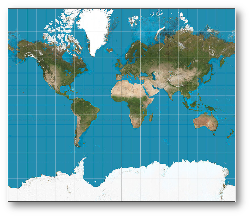
The familiar Mercator projection
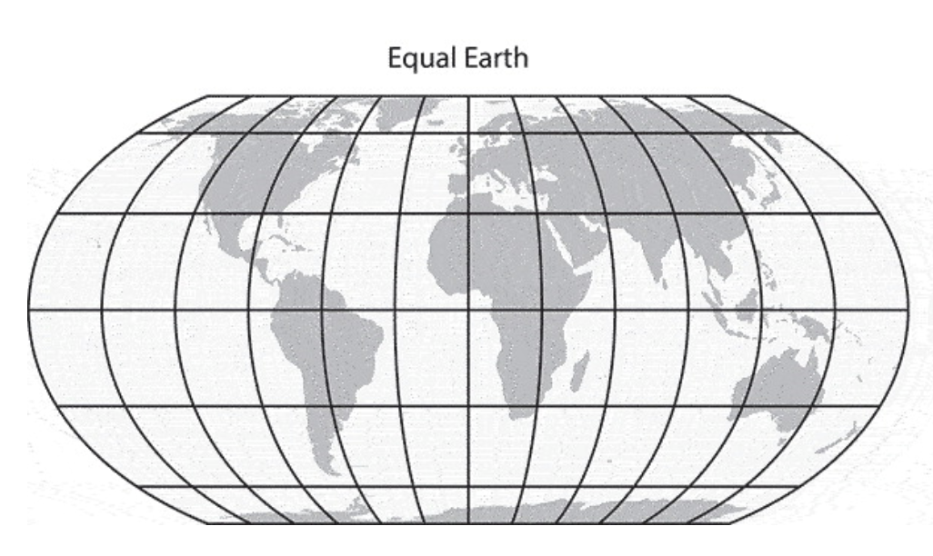
The Equal Earth projection. From Bojan Šavrič et al [1].

The Equal Earth projection “fixes” this, by expanding the mid-latitude surfaces areas of the globe so that they are in relatively better proportion with the high latitudes. The quotation marks are important, and will be explained shortly.

Mercator inevitably led to accusations that by diminishing Africa, it reinforced colonial worldviews. This is an old argument. A memorable 2001 episode of the West Wing has the “Organization of Cartographers for Social Equality” (surely there can be no other sort of cartographer?) come in to the White House on “Big Block of Cheese Day”, to urge C. J. Cregg to replace Mercator with the alternative Gall Peters projection, due to the former’s colonial roots (Gall Peters regularises the latitudinal parallels, “stretching” the mid latitudes). But the story is very, very much older than that. Mercator was first popularised in the European so-called “age of exploration” by cartographers pioneering in the new media of mass printing, and making maps for an society that was heavily involved in exploration, long distance commerce and colonization. Abraham Ortelius, for example, used the projection in his Theatrum Orbis Terrarum, including as a means of visualising familiar historical entities such as the Roman Empire and the lands of the Bible (below).
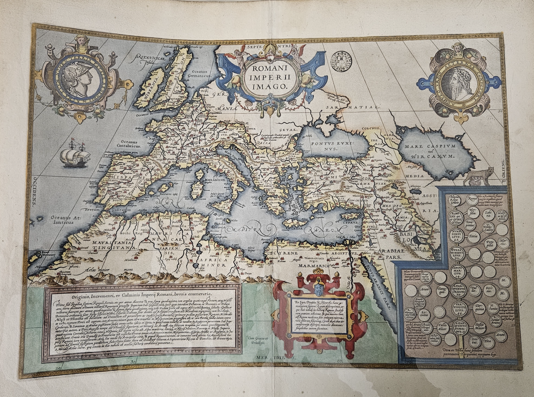
Abraham Ortelius’s map of the Roman Empire, c. 1570

Such entities did not need to include the continents of India or (mostly) Africa. The relevant positions of, say, Rome and Carthage or Athens and Sparta were much more important for the map’s readers. The Mercator projection was never intended to be diminishing or exclusionary, it simply reflected the historical preoccupations and worldviews of both historians and cartographers, while fulfilling navigational functions – reinforcing the former by doing the latter effectively. In later centuries however, as the world became ever more connected and as formal education became more widespread (there is a huge canon of Victorian classroom maps and atlases), the Mercator projection provided an increasingly familiar outline on which educated mapmakers began to hang their understanding of the wider world in which they lived. The two examples below, from Thomas Varty’s Series of Educational Maps from 1850, are examples of this. They show Africa as a terra incognita, with large white spaces covering the interior.
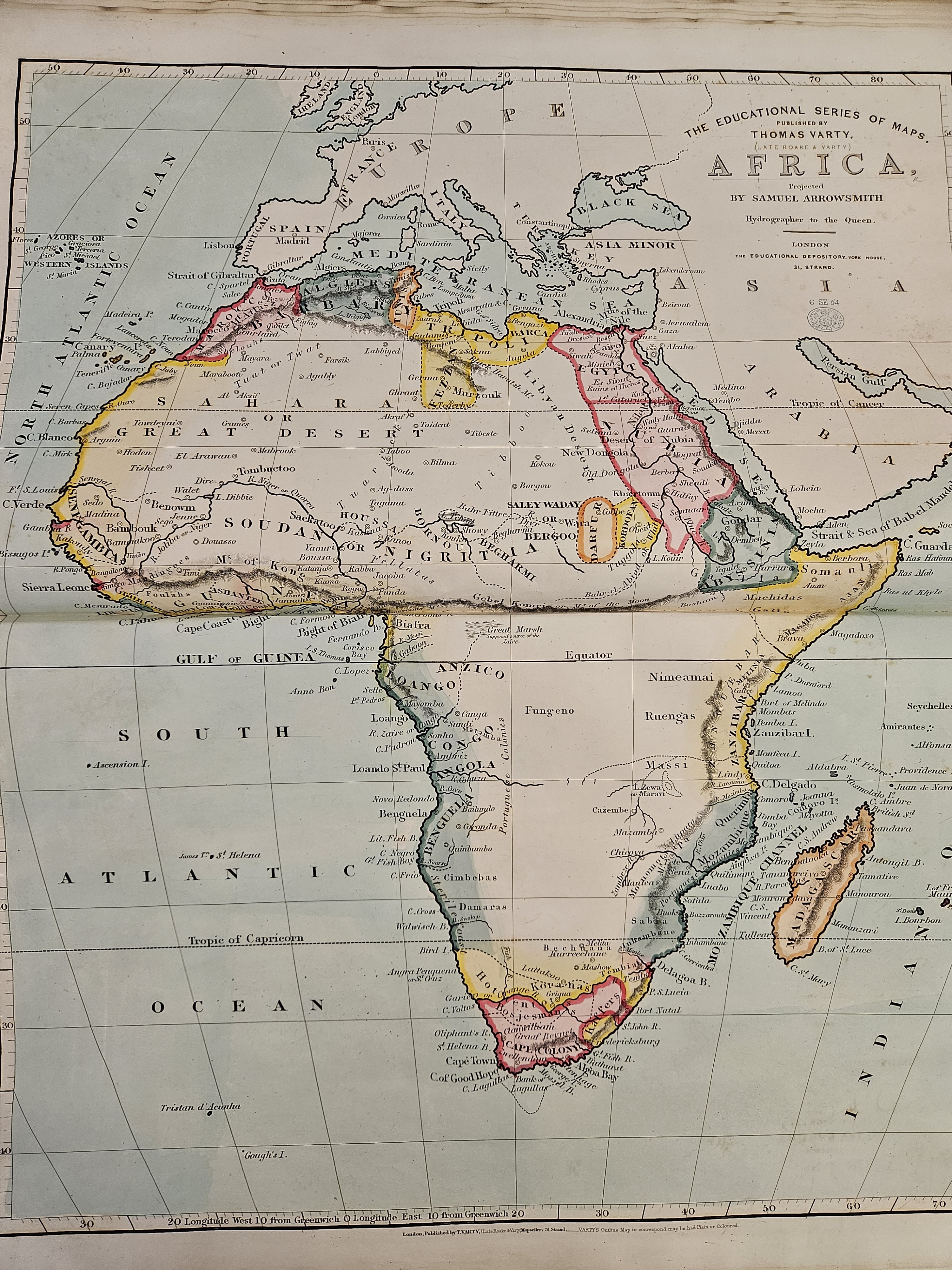
On the other hand, and from this same British perspective, India (or rather “Hindoostan”) is populated with cities, rivers, provinces, railways, infrastructure etc. You map what you know, the British certainly knew India at this time, and and Mercator was the container for that knowledge.
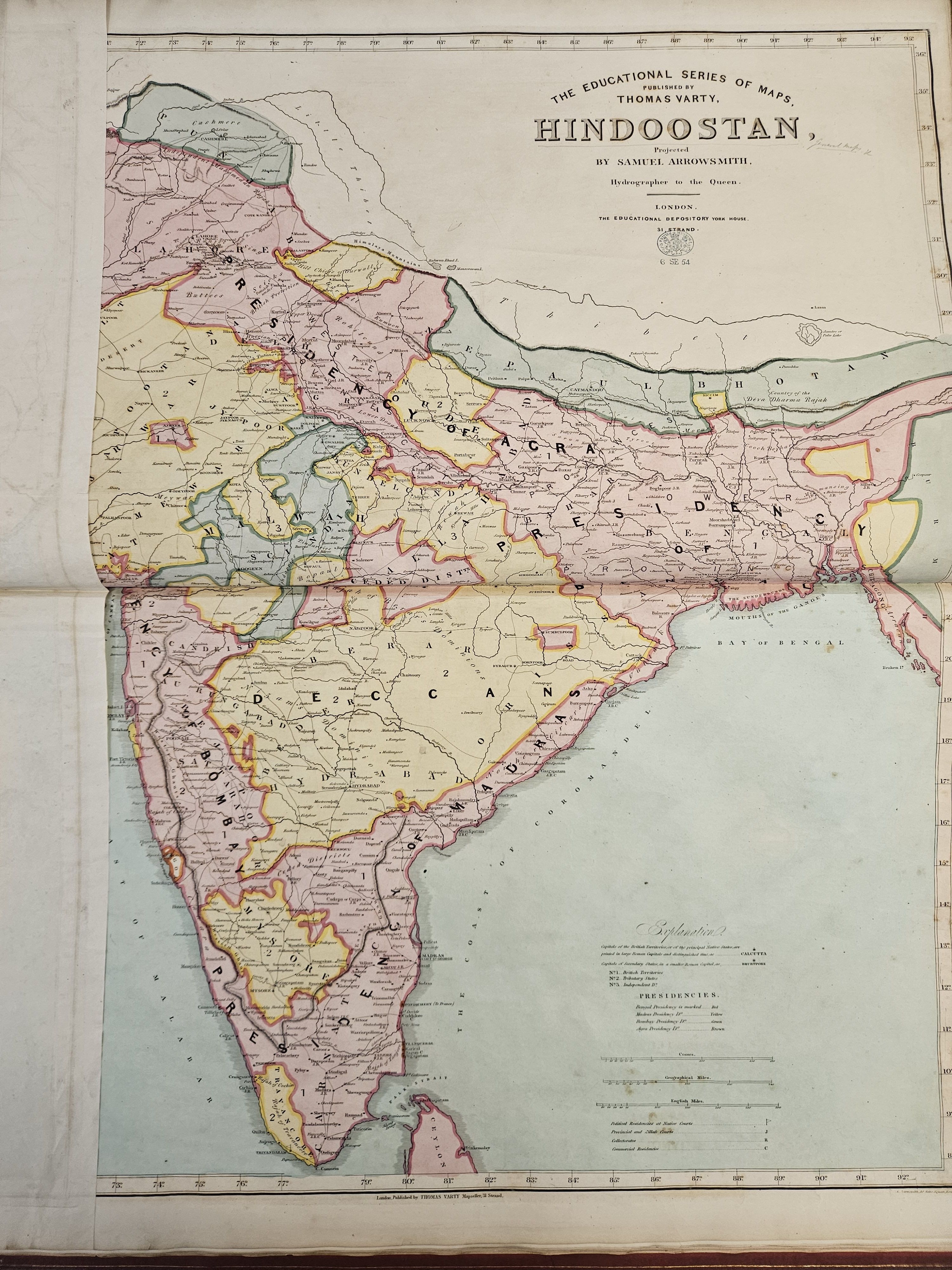
Equal Earth certainly goes some way to addressing the historic visual imbalance this created. However, and I will no doubt not be the only person to point out, it is not a “correct” or “accurate” visualisation, or even a “complete” one – no projection is. It is a set of mathematical abstractions and compromises which renders visible what is otherwise too huge to be visible. In that process, some combination of data – be it angles, surface area or symbology – will always be compromised. While the UN vote re-surfaces this debate and brings the matter back to public attention, Equal Earth is certainly not a panacea — a fact fully recognised by the authors of the paper in which it was originally proposed[1].

As with most things, the digital age has forced a further rethink, and on this I have one small quibble with the Equal Earth paper. In it, the authors state that web maps “are not designed to visualize the entire globe”. Well – in theory they are. The whole thing about web maps is that technically they place the entire globe in your pocket, allowing you to navigate, zoom, search and capture any piece of data pinned to any point on the earth’s surface using the Mercator supported referencing system that most of the big web maps (Google, Bing, Microsoft etc) use. It would be more accurate, I think, to say that the World Wide Web itself was not designed to visualise the globe, it was designed to link pieces of data together in a recognisable and navigable way. The Mercator projection was designed to link places together in a recognisable and navigable way – in the latter case quite literarily. In a digital world where places become data, it is easy to see the parallel. We have just plonked Mercator’s visualisation on top of our data systems out of pure convenience, just as the Victorians did when they were mapping the Empires of the nineteenth century. Mercator allowed you to navigate a journey from A to B, and the visualisation was only ever a secondary consideration to that task. Yet it came to condition the (visual) world view of millions, and to create international and intercontinental visual biases. Thanks to our insatiable desire for convenience, the WWW turbo charged these biases, and the UN has only just moved towards correcting them.

The moral of this story is that the idea that there can be only one form of map projection, whether that is Mercator, Equal Earth, Gall Peters, or any of the others, is not even a twentieth century idea, it is a nineteenth century one, or even earlier. Hopefully the UN vote will enable us to think more critically about what maps are for, how they relate to data, and whether the WWW, the defining infrastructure of the digital age, is really best served by a 450 year old map projection framework.

[1] Šavrič, B., Patterson, T. and Jenny, B., 2019. The equal earth map projection. International Journal of Geographical Information Science33(3), pp.454-465.

Great Lakes, Gulfs and Mountains: rethinking the “stability” of toponyms

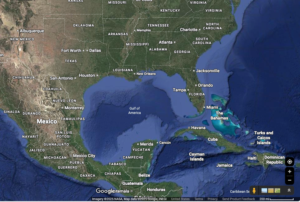
Toponyms were in the news again last week, with President Donald Trump’s pithily titled Executive Order, “Honoring the American History of the Great Lakes and Renaming Lake Ontario as Lake America”, as a somewhat idiosyncratic escalation of a wider trade dispute between the United States and Canada over tariffs. It recalls Trump’s similar Order of January 2025, “Restoring Names that Honor American Greatness”, whose most notable provision at the time was renaming the Gulf of Mexico as the Gulf of America. Famously there was controversy when Google Maps opted to conform to this order for users inside the US (see below), leading to objections from Mexico. And when the Associated Press refused to similarly toe the line, their access to White House was limited.

The Lake Ontario controversy is a glaringly obvious example of toponyms (or, to reference the Prime Minster of Canada’s response, more properly a hydronym in this case) being politically co-opted. Trump’s interventions in toponymy are unusual, not because they change or update toponyms for political reasons, but rather because of their alignment with a visceral and populist political narrative.  This is a fascinating departure from the way in which toponyms have historically been documented, updated or changed for the purposes of political or administrative control.  Careful surveys by trained sappers, the laying out of base lines, surveyors questioning local worthies as to the spelling and dialect of what Feature X has been known as since time immemorial; the transcription, projection and careful design of cadastral layouts and sybmologies in dusty Offices of Surveys etc… that is the path familiar to historical geographers; not the stroke of a presidential pen. An illuminating March 2025 blogpost by Violet Fox, a Cataloging and Metadata Librarian at Northwestern University’s Galter Health Sciences Library, following the Gulf of America renaming, notes the extraordinary speed at which this change appeared in the official vocabularies of the Library of Congress. Fox writes:

Although the special list was backdated to February 13th, no one was notified of these revision proposals until the morning of February 18th, and the deadline for submitting comments was the same day, February 18th. This meant that catalogers had less than 24 hours to respond to these proposals, and our international colleagues in earlier time zones had no opportunity to respond to these proposals.

Fox suggests that the cause of this unprecedented haste was “anticipatory obedience”, an inclination on the part of institutions “describing actions aligning with perceived expectations before explicit directives are given”.  I think this is true; but my point here is the historical development of documented toponyms are all about the incremental evolution of such expectations over time.  Normally, the process of organisation, documentation, and establishing the authority vested of the bureaucratic record is played out over years. In fact, Trump’s 2025 order makes a provision which received less coverage, but which illustrates this more familiar territory (pun intended) well.  North America’s highest mountain, Mt McKinley in Alaska, is named for the US President of the same name, assassinated in 1901. Mt McKinley is also known as “Denali”, a toponym derived from a Indigenous Koyukon term, which was federally recognised in the GNIS in 2015 by the Obama adminsitration.  The 2025 presidential order states:

Within 30 days of the date of this order, the Secretary of the Interior shall, consistent with 43 U.S.C. 364 through 364f, reinstate the name “Mount McKinley.” The Secretary shall subsequently update the Geographic Names Information System (GNIS) to reflect the renaming and reinstatement of Mount McKinley. The national park area surrounding Mount McKinley shall retain the name Denali National Park and Preserve.

This is, in some ways, a much more familiar and well rehearsed playing out of historic toponym disputes: two (in this case) variations of names for the same feature or place, both historically grounded, both culturally and politically charged, with different sources of authority claiming “correctness” in each case. Any historical geographer would recognise this scenario. Trump’s orders however directed the Secretary of the Interior to update the Geographic Names Information System (GNIS), the Federal Government’s official gazetteer of US toponyms with completely new names, literally overnight.  So how can the Lake Ontario/Gulf of Mexico orders be seen from a broader perspective of historical-geographic method?

Asking this question gives me the opportunity to trail a forthcoming paper I have coming out in a festschrift for my old friend and mentor Professor Charlotte Roueche, Tall edifices supported by strong foundations: open data in ancient and Byzantine studies, edited by Gabriel Bodard and Valeria Vitale. Fittingly, even necessarily, the volume will be available in Open Access. This paper, entitled “Engraving the soil: The challenges of defining spatial footprints in Cypriot cultural heritage” concerns the co-option of toponyms for political/colonial purposes in the history of Cyprus.  It is a reflection on the Heritage Gazetteer of Cyprus, a project that I ran with colleagues at King’s including, primus inter pares, Charlotte herself.  I have blogged about this project in the distant past – here and here. Cypriot toponyms are especially interesting because they exist in an historically contested and multilingual environment, with most places being known by both Cypriot Greek and Cypriot Turkish name variations. These variations are inevitably a source of disagreement both inside and outside officialdom: the very first OpenStreetMap “edit war” concerned a Northern Cypriot village with the Turkish name Ozanköy and the Greek name Kazaphani.  The dispute concerned which of these names should be the “primary” one, the one presented to OpenStreetMap users as the name by which the village is generally known.  This inevitably introduces questions, such as what do “primarily” and “generally” mean, and “known to whom”? “The digital” introduces the capacity for conflict, as well as an instinct to reduce contested names to one “correct” form, whilst doing nothing to resolve the actual question of correctness. In the paper, I attempt to describe how networked modelling of toponyms using agnostic line strings to represent different variations can surface and visualise different representations, including competing ones. This at least allows us to consider what “correct” might mean in different contexts. Specifically, I argue that

The given name of a place in use at any one time has different textual witnesses across different textual sources. A toponym is never just a single name, it is a network of different versions of multiple names.

Where this network is hidden, whether by accident or design, toponyms exhibit what historians of cartography call “ontological stability”.  An “official” version of ontological stability for Cypriot toponyms was provided by Herbert Horatio Kitchener’s Complete Trigonometrical Survey of the island, which provided an “authoritative” (and extremely accurate, by modern scientific standards)  overview of the island, and the spellings of its toponymic variations:

Kitchener represents a datafication of observable reality, simultaneously containing and encoding all the ambiguities that human observation entails. In doing so, it negates ambiguity, presenting a univocal view of the world.

While Kitchener’s map provided ontological stability for the island in 1885, it was nonetheless fragile; of utility primarily as a means of taxation, administration, census and military deployment. It was not a map widely, if at all, recognised by the Greek or Turkish Cypriot inhabitants of the island, unless forced to do so through interaction with governmental authority. I argue that the map was politically legitimate as far as its own purposes went, but at the same time was ontologically unstable.

So what sort of ontological stability might “Lake America” and indeed the “Gulf of Mexico” now enjoy?  In the paper I go on to say:

[I]n the context of places with historically documented names (which includes physical features and settlements in existence long before their names were documented in written records), gazetteers in fact highlight toponyms’ lack of such stability

In other words, place naming is, and always has been, an exercise in bureaucratic process, documentation and direction, and thus control.  As the case of Cyprus shows, you write toponyms down in official lists, providing a “univocal view of the world”, only if you have reason to do so. Those reasons are always to do with the authority to do something to or with the territory being named.

I believe these two cases of modern place-renaming highlight a very important point: “ontological stability” is certainly not just a product of linguistic, textual or cultural disagreement about a particular toponym. It can also be introduced through direct political intervention, for clear political ends.  And this shows that there is surely a splendid irony in a US administration which bases its entire narrative on overthrowing old orders of establishment and bureaucracy putting out eye-catching ventures into toponymy which riff on three hundred plus years of establishment and bureaucracy.

A History of Place 3: Dead Trees and Digital Content

The stated aim of this series of posts is to reflect on what it means to write a book in the Digital Humanities. This is not a subject one can address without discussing how digital content and paper publication can work together. I need to say at the outset that A History of Place does not have any digital content per se. Therefore, what follows is a more general reflection of what seems to be going on at the moment, perhaps framing what I’d like to do for my next book.

It is hardly a secret that the world of academic publication is not particularly well set up for the publication of digital research data. Of course the “prevailing wind” in these waters is the need for high-quality publications to secure scholarly reputation, and with it the keys to the kingdom of job security, tenure and promotion. As long as DH happens in universities, the need to publish in order to be tenured and promoted is not going to go away  There is also the symbiotically related need to satisfy the metrics imposed by governments and funding agencies. In the UK for example, the upcoming Research Excellence Framework exercise explicitly sets out to encourage (ethically grounded) Open Access publication, but this does nothing to problematize the distinction, which is particularly acute in DH, between peer-reviewed research outputs (which can be digital or analogue) and research data, which is perforce digital only. Yet research data publication is a fundamental intellectual requirement for many DH projects and practitioners. There is therefore a paradox of sorts, a set of shifting and, at times, conflicting motivations and considerations, which those contemplating such are faced with.

It seems to be that journals and publishers are responding to this paradox in two ways. The first facilitates the publication of traditional articles online, albeit short ones, which draw on research datasets which are deposited elsewhere, and to require certain minimum standards of preservation, access and longevity. Ubiquity Press’s Journal of Open Archaeological Data, as the name suggests, follows this model. It describes its practice thus:

JOAD publishes data papers, which do not contain research results but rather a concise description of a dataset, and where to find it. Papers will only be accepted for datasets that authors agree to make freely available in a public repository. This means that they have been deposited in a data repository under an open licence (such as a Creative Commons Zero licence), and are therefore freely available to anyone with an internet connection, anywhere in the world.

In order to be accepted, the “data paper” must reference a dataset which has been accepted for accession in one of 11 “recommended repositories”, including, for example, the Archaeology Data Service and Open Context. It recommends that more conventional research papers then reference the data paper.

The second response is more monolithic, where a publisher takes on both the data produced by or for the publication, and hosts/mounts it online. One early adopter of this model is Stanford University Press’s digital scholarship project, which seeks to

[A]dvance a publishing process that helps authors develop their concept (in both content and form) and reach their market effectively to confer the same level of academic credibility on digital projects as print books receive.

In 2014, when I spent a period at Stanford’s Center for Electronic and Spatial Text Analysis, I was privileged to meet Nicolas Bauch, who was working on SUP’s first project of this type, Enchanting the Desert. This wonderful publication presents and discusses the photographic archive of Henry Peabody, who visited the Grand Canyon in 1879, and produced a series of landscape photographs. Bauch’s work enriches the presentation and context of these photographs by showing them alongside viewsheds of the Grand Canyon from the points where they were taken, this providing a landscape-level picture of what Peabody himself would have perceived.

However, to meet the mission SUP sets out in the passage quoted above requires significant resources, effort and institutional commitment over the longer term. It also depends on the preservation not only of the data (which JOAD does by linking to trusted repositories), but also the software which keeps the data accessible and usable. This in turn presents the problem encapsulated rather nicely in the observation that data ages like a fine wine, whereas software applications age like fish (much as I wish I could claim to be the source of this comparison, I’m afraid I can’t). This is also the case where a book (or thesis) produces data which in turn depends on a specialized third-party application. A good example of this would be 3D visualization files that need Unity or Blender, or GIS shapefiles which need ESRI plugins. These data will only be useful as long as those applications are supported.

My advice therefore to anyone contemplating such a publication, which potentially includes advice to my future self, is to go for pragmatism. Bearing in mind the truism about wine and fish, and software dependency, it probably makes sense to pare down the functional aspect on any digital output, and focus on the representational, i.e. the data itself. Ideally, I think one would go down the JOAD route, and have one’s data and deposit one’s data in a trusted repository, which has the professional skills and resources to keep the data available. Or, if you are lucky enough to work for an enlightened and forward-thinking Higher Education Institution, a better option still would be to have its IT infrastructure services accession, publish and maintain your data, so that it can be cross-referred with your paper book which, in a wonderfully “circle of life” sort of way, will contribute to the HEI’s own academic standing and reputation.

One absolutely key piece of advice – probably one of the few aspects of this, in fact, that anyone involved in such a process would agree on – is that any Universal Resource Indicators you use must be reliably persistent. This was the approach we adopted in the Heritage Gazetteer of Cyprus project, one of whose main aims was to provide a structure for URI references to toponyms that was both consistent and persistent, and thus citable – as my colleague Tassos Pappacostas demonstrated in his online Inventory of Byzantine Churches on Cyprus, published alongside the HGC precisely to demonstrate the utility of persistent URIs for referencing. As I argue in Chapter 7 of A History of Place in fact, developing resources which promote the “citability” of place, and link the flexibility of spatial web annotations with the academic authority of formal gazetteer and library structures is one of the key challenges for the spatial humanities itself.

I do feel that one further piece of advice needs a mention, especially when citing web pages rather than data. Ensure the page is archived using the Internet Archive’s Wayback Machine, then cite the Wayback link, as advocated earlier this year here:

This is very sound advice, as this will ensure persistence even the website itself depreciates.

Returning to the publication of data alongside a print publication however: the minimum one can do is simply purchase a domain name and publish the data oneself, alongside the book. This greatly reduces the risk of obsolescence, keeps you in control, and recognizes the fact that books start to date the moment they are published by their very nature.

All these approaches require a certain amount of critical reduction of the idea that publishing a book is a railway buffer which marks the conclusion of a major part of one’s career. Remember – especially if you are early career –  that this will not be the last thing you ever publish, digitally or otherwise. Until those bells and whistles hybrid digital/paper publishing model arrive, it’s necessary to remember that there are all sorts of ways data can be preserved, sustained and form a valuable part of a “traditional” monograph. The main thing for your own monograph is to find the one that fits, and it may be that you have to face down the norms and expectations of the traditional academic monograph, and settle for something that works, as opposed to something that is perfect.

A History of Place 2: Indexing

I opted to compile the index of A History of Place myself. I made this choice for various reasons, but the main one was that the index seemed to me to be an important part of the volume’s framing and presentation. Reflecting on this, it seems a little ironic, as in some ways a book’s index exemplifies the age of the pre-digital publication. Using someone’s pre-decided terms to navigate a text is antithetical to the expectations and practices of our Googleized society. Let’s face it, no one reading the e-version of A History of Place is ever going to use the index, and in some ways compiling the index manually, reviewing the manuscript and linking key words with numbers which would, in due course, correspond with dead-tree pages felt almost like a subversive act.

But like an expertly curated library catalogue, an expertly compiled index is an articulation of a work’s structure and requires a set of decisions that are more complex than they may at first seem. These must consider the expectations and needs of your readers, and at the same time reflect, as accurately as possible, the current terminologies of your field. The process of indexing made me realize it gives one a chance (forces one in fact) to reflect – albeit in a bit of a hurry – on the key categories, terminology and labels that oneself and one’s peers use to describe what they do. It thus forces one to think about what terms mean, and which are important – both to one’s own work, and to the community more broadly (some of whom might even read the book).

There is also the importance of having a reliable structure. As I outline in the book itself, and have written elsewhere in relation to crowdsourcing, some have argued that using collaborative (or crowdsourced) methods to tag library catalogues for the purposes of searching and information retrieval disconnects scholarly communities from the ‘gatekeepers of the cultural record’, which undermines the very idea of the academic source itself (Cole & Hackett, 2010: 112–23) [1]. Cole and Hackett go on to highlight the distinction between “search” and “research”; whereby the former offers a flat and acrticial way into a resource (or collection of resources) based on user-defined keywords, whereas the latter offers a curated and grounded “map” of the resource. While, in this context, Cole and Hackett were talking about library catalogues, exactly the same principle applies book indices.

I don’t wish to overthink what remains, after all, a rather unglamorous part of the writing process; however even in the digital age, the index continues to matter. Even so, there is no shame at all in busy academics (or any other writers) delegating the task of compiling an index to a student or contract worker, provided of course that person is fully and properly paid for their efforts, and not exploited.  But I think it is necessary to have a conversation with that person about strategy and decision making. What follows is some examples from A History of Place which exemplify issues which authors might wish to consider when approaching their index, and/or discussing with their indexer.  By discussing these examples I try to explore the decisions I made about which terms and sub-terms I decided to include, and why.

To begin with the practicalities, the wise advice provided by Routledge was:

You don’t have to wait for the numbered page proofs of your book to arrive – start to think about entries when you have completed the final draft of your typescript. The index is always the last part of the book to be put together and submission of your final copy will be subject to a tight deadline. Preparing it now may save you time later on. [emphasis added]

I would suggest that it is a good idea to think about these even before the numbered proofs turn up.

And then

On receipt of [numbered proofs], you should return to your already-prepared list of words. Use the numbered proofs to go through your book chapter by chapter and insert the page numbers against each entry on your list. (You can use the ‘Find’ function to locate words within the proof PDF.)

The gap between compiling your original list and adding page numbers will help you to evaluate your designated entries once more. Have you missed anything obvious? Are your cross references accurate and relevant? Revisit the questions under the heading ‘Choice of Entry’.

When you are satisfied that your index is complete, put it into alphabetical order.

You will come to love proper names in the early stages of this process. For example there is only one way you can represent Abraham Ortelius, or Tim Berners-Lee in your index; and no decisions involved in how to define the page limits for the references to them.

However, the process of selecting abstract terms for inclusion is more challenging. There were arguments both for and against including the word “Bias”, for example.  All maps are biased of course, and in theory this could have applied to most of the examples I discuss. However, it forms an important topic of much recent literature on neogeography (for example), which address the ways in which neogeographic platforms perpetuate social bias due to their demographies (mostly white, male, Western etc). Therefore, inclusion made sense as it referenced explicit discussion of bias in secondary literature (mostly in the chapter on neogeography). It was possible to connect this to “collective bias” via the cross-referencing option of “see also”, of which Routledge advises:

  • See

If the entry is purely a cross reference, the entry is followed by a single space, the word ‘see’ in italics and the cross reference. For example:

sensitivity see tolerances

Note that under the entry for ‘tolerances’ there is no cross reference back to ‘sensitivity’. Page numbers should not be stated where ‘see’ is used.

  • See also

This should be used to direct the reader to additional related information.

This is a useful distinction, because it forces one to consider whether terms are synonymous versus relevant.  “Bias” and “collective bias” is a good example as the original term is somewhat fluid and required some pre-hoc consideration but is clearly different from “collective bias”.

Highly specific and specialized terms presented less of a problem.  Chorography, for example, features prominently in my index, but it could potentially have had any number of “see also…” references. However, given it is such a specialized term, I made a pragmatic decision (based partly on what I thought a reader using the index would need/want) to have it simply standalone, with no cross-references at all.

The most challenging terms were the big, important ones with multiple potential meanings. “GIS” is probably the most obvious example for A History of Place. Most of my arguments touch in some way on how spatial thinking in the humanities has emerged from, and been shaped by, GIS and related technologies, so the challenge was to divide the term up in to subsections which are a) useful for a potential reader, and b) reflective of disciplinary practices. My strategy was to treat branches of GIS which have been explicitly recognized and differentiated in the literature – such as Critical GIS; Qualitative GIS; Participatory GIS Historical GIS and Literary GIS – as separate index terms, linked as “see also” references. These are then tied only to specific occurrences of that term in each case. For discussions of GIS not explicitly relating to those terms, I used “and…” references which were tied to my chapter themes. This enabled me to divide the myriad references to GIS into sections which accord logically with the book’s structure – “- and archaeology” “- and and spatial analysis”, “-and text”, “-and crowdsourcing” and so on.

“Neogeography” created similar problems, but this type of term is compounded when the field moves so quickly. A recent paper by Linda See and others illustrates just how difficult this term is to pin down. I think all I can draw from this is that such index terms will need some considerable revisiting in the event of there being any future editions(!).

So, the agenda for that initial conversation with your indexer should, I would suggest, include:

  • Strategies for dealing with abstract terms, and deciding which are relevant and which are not
  • Highlight important, wide ranging terms, and what sub-categories you think they should have
  • How to identify specific terms which may or may not need “see also” references
  • Which sort of circumstances demand you to signpost between related terms using the “see” option.
  • Flag terms – for your won reference if nothing else – that may not be easily “future proofed”.


[1] Cole, R., & Hackett, C. (2010). Search vs. Research: Full-text repositories, granularity and the concept of “source” in the digital environment. In C. Avery & M. Holmlund (Eds.), Better off forgetting? Essays on archives, public policy and collective memory (pp. 112–123). Toronto.

Call for members: Major new Institute opens at King’s College London with Getty Foundation support

The Project

The 18-month Institute in Digital Art History is led by King’s College London’s Department of Digital Humanities (DDH) and Department of Classics, in collaboration with HumLab at the University of Umeå, with grant support provided by the Getty Foundation as part of its Digital Art History initiative.

It will convene two international meetings where Members of the Institute will survey, analyse and debate the current state of digital art history, and map out its future research agenda. It will also design and develop a Proof of Concept (PoC) to help deliver this agenda. The source code for this PoC will be made available online, and will form the basis for further discussions, development of research questions and project proposals after the end of the programme.

To achieve these aims we will bring together leading experts in the field to offer a multi-vocal and interdisciplinary perspective on three areas of pressing concern to digital art history:

●       Provenance, the meta-information about ancient art objects,

●       Geographies, the paths those objects take through time and space, and

●       Visualization, the methods used to render art objects and collections in visual media.

Current Digital Humanities (DH) research in this area has a strong focus on Linked Open Data (LOD), and so we will begin our exploration with a focus on LOD. This geographical emphasis on the art of the ancient Mediterranean world will be continued in the second meeting to be held in Athens. The Mediterranean has received much attention from both the Digital Classics and DH communities, and is thus rich in resources and content. The programme will, therefore, bring together two existing scholarly fields and seek to improve and facilitate dialogue between them.

We will assign Members to groups according to the three areas of focus above. These groups will be tasked with producing a detailed research specification, detailing the most important next steps for that part of the field, how current methods can best be employed to make them, and what new research questions the participants see emerging.

The meetings will follow a similar format, with initial participant presentations and introductions followed by collaborative programme development and design activities within the research groups, including scoping of relevant aspects of the PoC. This will be followed by further discussion and collaborative writing which will form the basis of the event’s report. Each day will conclude with a plenary feedback session, where participants will share and discuss short reports on their activities. All of the sessions will be filmed for archival and note-taking purposes, and professional facilitators will assist in the process at various points.

The scholarly outputs, along with the research specifications for the PoC, will provide tangible foci for a robust, vibrant and sustainable research network, comprising the Institute participants as a core, but extending across the emerging international and interdisciplinary landscape of digital art history. At the same time, the programme will provide participants with support and space for developing their own personal academic agendas and profiles. In particular, Members will be encouraged to and offered collegial support in developing publications, both single- and co-authored following their own research interests and those related to the Institute.


The Project Team

The core team comprises of Dr Stuart Dunn (DDH), Professor Graeme Earl(DDH) and Dr Will Wootton (Classics) at King’s College London, and Dr Anna Foka of HumLab, Umeå University.

They are supported by an Advisory Board consisting of international independent experts in the fields of art history, Digital Humanities and LOD. These are: Professor Tula Giannini (Chair; Pratt Institute, New York), Dr Gabriel Bodard (Institute of Classical Studies), Professor Barbara Borg (University of Exeter), Dr Arianna Ciula (King’s Digital Laboratory), Professor Donna Kurtz (University of Oxford), and Dr Michael Squire (King’s College London).


Call for participation
We are now pleased to invite applications to participate as Members in the programme. Applications are invited from art historians and professional curators who (or whose institutions) have a proven and established record in using digital methods, have already committed resources, or have a firm interest in developing their research agendas in art history, archaeology, museum studies, and LOD. You should also be prepared to contribute to the design of the PoC (e.g. providing data or tools, defining requirements), which will be developed in the timeframe of the project by experts at King’s Digital Lab.

Membership is open to advanced doctoral students (provided they can demonstrate close alignment of their thesis with the aims of the programme), Faculty members at any level in all relevant fields, and GLAM curation professionals.

Participation will primarily take the form of attending the Institute’s two meetings:

King’s College London: 3rd – 14th September 2018

Swedish Institute at Athens: 1st-12th April 2019

We anticipate offering up to eighteen places on the programme. All travel and accommodation expenses to London and Athens will be covered. Membership is dependent upon commitment to attend both events for the full duration.

Potential applicants are welcome to contact the programme director with any questions: stuart.dunn@kcl.ac.uk.

To apply, please submit a single A4 PDF document set out as follows. Please ensure your application includes your name, email address, institutional affiliation, and street address.


Applicant Statement (ONE page)
This should state what you would bring to the programme, the nature of your current work and involvement of digital art history, and what you believe you could gain as a Member of the Institute. There is no need to indicate which of the three areas you are most interested in (although you may if you wish); we will use your submission to create the groups, considering both complementary expertise and the ability for some members to act as translators between the three areas.

Applicant CV (TWO pages)
This section should provide a two-page CV, including your five most relevant publications (including digital resources if applicable).

Institutional support (ONE page)
We are keen for the ideas generated in the programme to be taken up and developed by the community after the period of funding has finished. Therefore, please use this section to provide answers to the following questions relating to your institution and its capacity:

1.     Does your institution provide specialist Research Software Development or other IT support for DH/LOD projects?

2.     Is there a specialist DH unit or centre?

3.     Do you, or your institution, hold or host any relevant data collections, physical collections, or archives?

4.     Does your institution have hardware capacity for developing digital projects (e.g. specialist scanning equipment), or digital infrastructure facilities?

5.     How will you transfer knowledge, expertise, contacts and tools gained through your participation to your institution?

6.     Will your institution a) be able to contribute to the programme in any way, or b) offer you any practical support in developing any research of your own which arises from the programme? If so, give details.

7.     What metrics will you apply to evaluate the impact of the Ancient Itineraries programme a) on your own professional activities and b) on your institution?

Selection and timeline
All proposals will be reviewed by the Advisory Board, and members will be selected on the basis of their recommendations.

Please email the documents specified above as a single PDF document to stuart.dunn@kcl.ac.uk by Friday 1st June 2018, 16:00 (British Summer Time). We will be unable to consider any applications received after this. Please use the subject line “Ancient Itineraries” in your email. 

Applicants will be notified of the outcomes on or before 19th June 2018.

Privacy statement

All data you submit with your application will be stored securely on King’s College London’s electronic systems. It will not be shared, except in strict confidence with Advisory Board members for the purposes of evaluation. Furthermore your name, contact details and country of residence will be shared, in similar confidence, with the Getty Foundation to ensure compliance with US law and any applicable US sanctions. Further information on KCL’s data protection and compliance policies may be found here: https://www.kcl.ac.uk/terms/privacy.aspx; and information on the Getty Foundation’s privacy policies may be found here: http://www.getty.edu/legal/privacy.html.

Your information will not be used for any other purpose, or shared any further, and will be destroyed when the member selection process is completed.

If you have any queries in relation to how your rights are upheld, please contact us at digitalhumanites@kcl.ac.uk, or KCL’s Information Compliance team at info-compliance@kcl.ac.uk).

Sourcing GIS data

Where does one get GIS data for teaching purposes? This is the sort of question one might ask on Twitter. However while, like many, I have learned to overcome, or at least creatively ignore, the constraints of 140 characters, it can’t really be done for a question this broad, or with as many attendant sub-issues. That said, this post was finally edged into existence by a Twitter follow, from “Canadian GIS & Geomatics Resources” (@CanadianGIS). So many thanks to them for the unintended prod. The linked website of this account states:

I am sure that almost any geomatics professional would agree that a major part of any GIS are the data sets involved. The data can be in the form of vectors, rasters, aerial photography or statistical tabular data and most often the data component can be very costly or labor intensive.

Too true. And as the university term ends, reviewing the issue from the point of view of teaching seems apposite.

First, of course, students need to know what a shapefile actually is. A shapefile is the building block of GIS, the datasets where individual map layers live. Points, lines, polygons: Cartesian geography are what makes the world go round – or at least the digital world, if we accept the oft-quoted statistic that 80% or all online material is in some way georeferenced. I have made various efforts to establish the veracity of this statistic or otherwise, and if anyone has any leads, I would be most grateful if you would share them with me by email or, better still, in the comments section here. Surely it can’t be any less than that now, with the emergence of mobile computing and the saturation of the 4G smartphone market. Anyway…

In my postgraduate course, part of a Digital Humanities MA programme, on digital mapping, I have used the Ordnance Survey Open Data resources, Geofabrik, an on-demand batch download service for OpenStreetMap data, Web Feature Service data from Westminster City Council, and  continental coastline data from the European Environment Agency. The first two in particular are useful, as they provide different perspectives from respectively the central mapping verses open source/crowdsourced geodata angles. But in the expediency required of teaching a module, they main virtues are the fact they’re free, (fairly) reliable, free, malleable, and can be delivered straight to the student’s machine, or classroom PC (infrastructure problems aside – but that’s a different matter) – and uploaded to a package such as QGIS.  But I also use some shapefiles, specifically point files, I created myself. Students should also be encouraged to consider how (and where) the data comes from. This seems to be the most important aspect of geospatial within the Digital Humanities. This data is out there, it can be downloaded, but to understand what it actually *is*, what it actually means, you have to create it. That can mean writing Python scripts to extract toponyms, considering how place is represented in a text, or poring over Google Earth to identify latitude/longitude references for archaeological features.

This goes to the heart of what it means to create geodata, certainly in the Digital Humanities. Like the Ordnance Survey and Geofabrik, much of the geodata around us on the internet arrives pre-packaged and with all its assumptions hidden from view.  Agnieszka Leszczynski, whose excellent work on the distinction between quantitative and qualitative geography I have been re-reading as part of preparation for various forthcoming writings, calls this a ‘datalogical’ view of the world. Everything is abstracted as computable points, lines and polygons (or rasters). Such data is abstracted from the ‘infological’ view of the world, as understood by the humanities.  As Leszczynski puts is: “The conceptual errors and semantic ambiguities of representation in the infologial world propagate and assume materiality in the form of bits and bytes”[1]. It is this process of assumption that a good DH module on digital mapping must address.

In the course of this module I have also become aware of important intellectual gaps in this sort of provision. Nowhere, for example, in either the OS or Geofabrik datasets, is there information in British public Rights of Way (PROWs). I’m going to be needing this data later in the summer for my own research on the historical geography of corpse roads (more here in the future, I hope). But a bit of Googling turned up the following blog reply from OS at the time of the OS data release in April 2010:

I’ve done some more digging on ROW information. It is the IP of the Local Authorities and currently we have an agreement that allows us to to include it in OS Explorer and OS Landranger Maps. Copies of the ‘Definitive Map’ are passed to our Data Collection and Management team where any changes are put into our GIS system in a vector format. These changes get fed through to Cartographic Production who update the ROW information within our raster mapping. Digitising the changes in this way is actually something we’ve not been doing for very long so we don’t have a full coverage in vector format, but it seems the answer to your question is a bit of both! I hope that makes sense![2]

So… teaching GIS in the arcane backstreets of the (digital) spatial humanities still means seeing what is not there due to IP as well as what is.

[1] Leszczynski, Agnieszka. “Quantitative Limits to Qualitative Engagements: GIS, Its Critics, and the Philosophical Divide∗.” The Professional Geographer 61.3 (2009): 350-365.

[2] https://www.ordnancesurvey.co.uk/blog/2010/04/os-opendata-goes-live/