Last week the United Nations General Assembly voted to institute the Equal Earth projection system as the basis for the default world map, following a campaign by Togo and other African nations. Although in the news now, this campaign has long been backed by other African Union countries, and many in the world of cartography. Projection systems are the mathematical processes which convert the surface of the spherical earth into a flat map for display on paper, or indeed a screen. Equal Earth replaces the 450 year old go-to Mercator projection.
Mercator is the ubiquitous cylindrical map visualisation which “stretches” the higher latitudes and shrinks those of the equatorial regions. Cut an orange into eight wedges, lay the eight pieces of peel side by side, then stretch the points out to meet at the top at the bottom, and you get the idea. The benefit of this projection – and the reason why it has been the go-to for 450 years – is that it conformal, i.e. it preserves the relative angles between set points. So if you wish to get from Southampton to New York, Mercator will provide the degrees of the angle between them, and thus the compass bearing you need. At the same time though, this stretching distorts surface area. In particular, it diminishes the relative sizes of mid-latitude zones like Africa and Australia, putting them on a visual par with North America. This is wrong: North America would, in fact, fit into either continent several times over.
This issue forms an important part of my teaching on spatial humanities and the history of cartography. One of my favourite resources is truesize.net, a Mercator world map where you can drag the outlines of countries around and compare their actual surface areas, overlaying them on each other. Dragging Australia on to Greenland and showing that it is at least five time times its size guarantees one of those pleasing moments when undergraduates actually gasp.
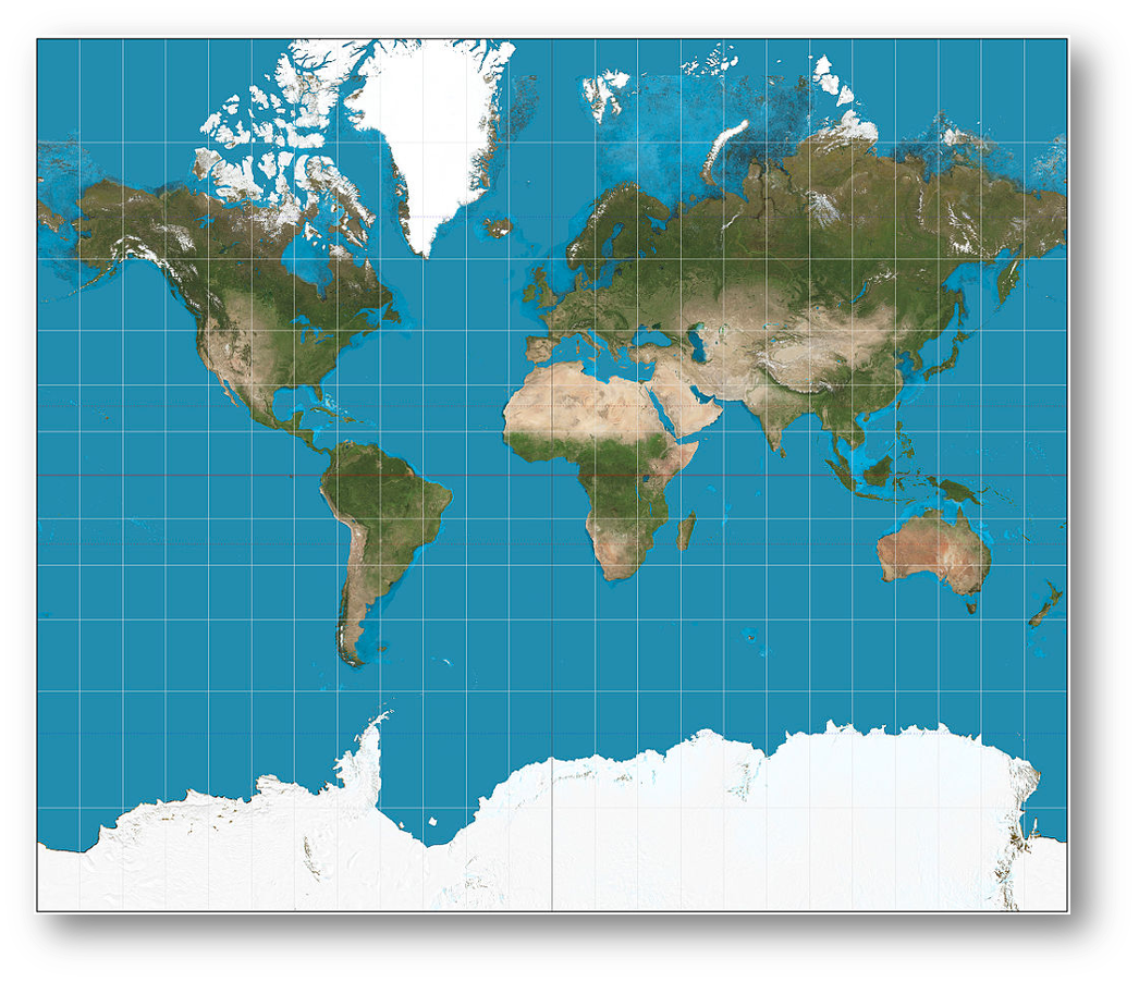
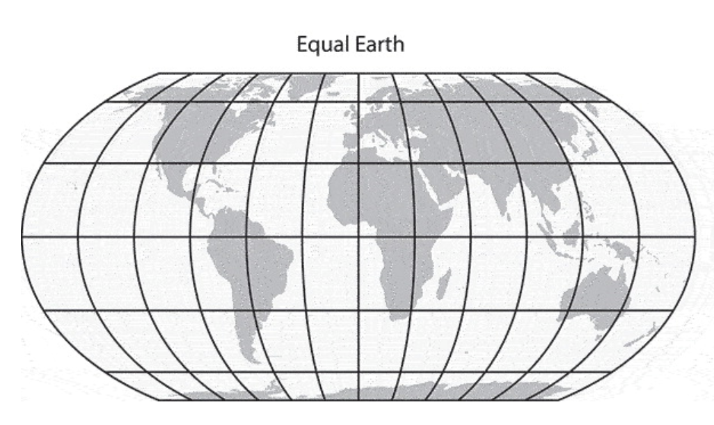
The Equal Earth projection “fixes” this, by expanding the mid-latitude surfaces areas of the globe so that they are in relatively better proportion with the high latitudes. The quotation marks are important, and will be explained shortly.
Mercator inevitably led to accusations that by diminishing Africa, it reinforced colonial worldviews. This is an old argument. A memorable 2001 episode of the West Wing has the “Organization of Cartographers for Social Equality” (surely there can be no other sort of cartographer?) come in to the White House on “Big Block of Cheese Day”, to urge C. J. Cregg to replace Mercator with the alternative Gall Peters projection, due to the former’s colonial roots (Gall Peters regularises the latitudinal parallels, “stretching” the mid latitudes). But the story is very, very much older than that. Mercator was first popularised in the European so-called “age of exploration” by cartographers pioneering in the new media of mass printing, and making maps for an society that was heavily involved in exploration, long distance commerce and colonization. Abraham Ortelius, for example, used the projection in his Theatrum Orbis Terrarum, including as a means of visualising familiar historical entities such as the Roman Empire and the lands of the Bible (below).
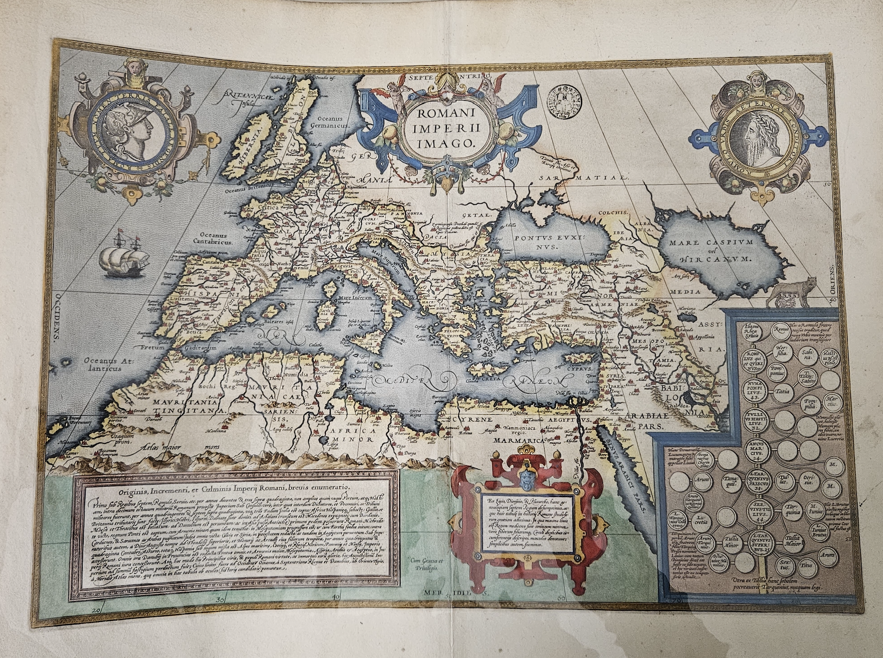
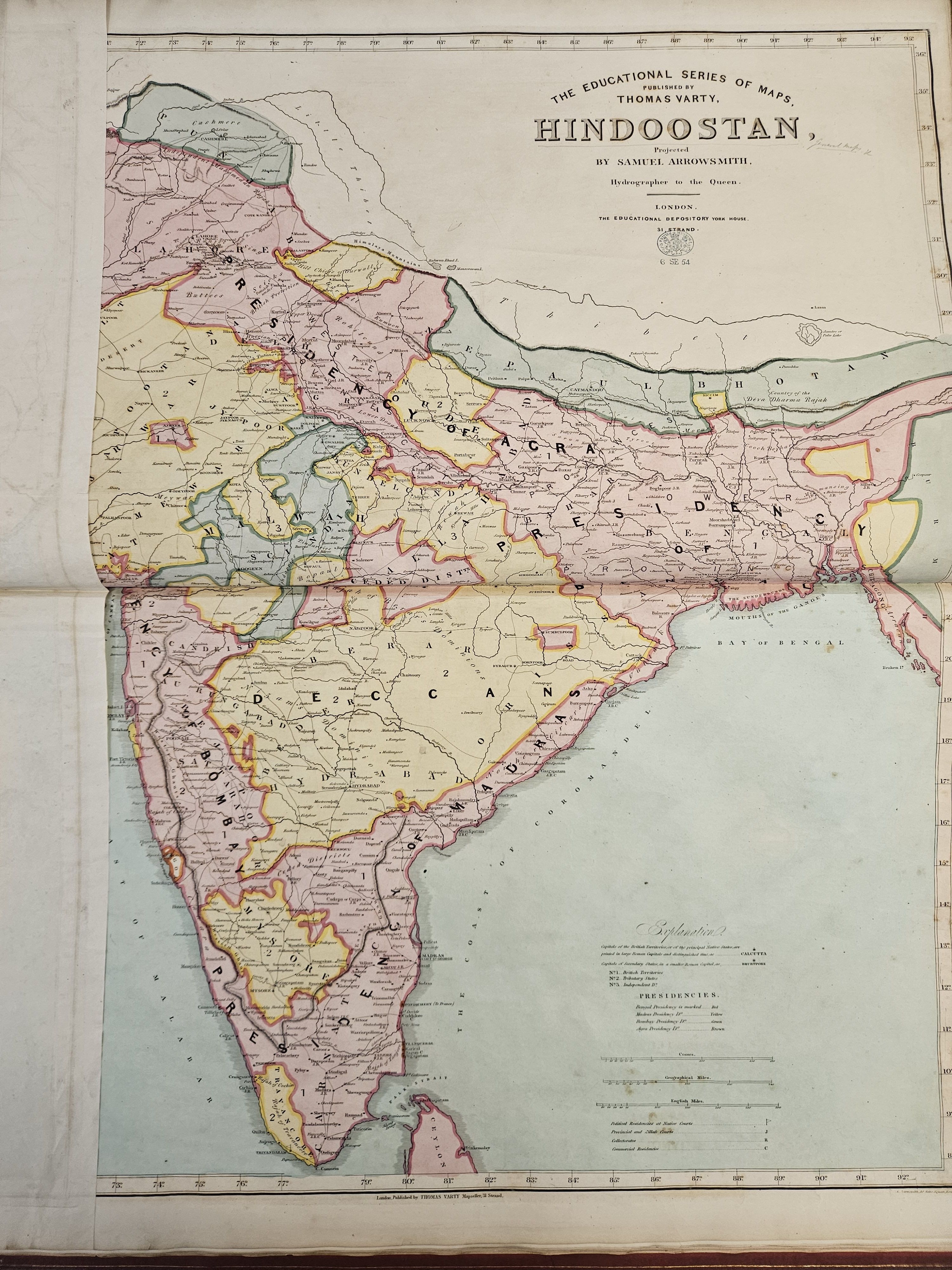
Such entities did not need to include the continents of India or (mostly) Africa. The relevant positions of, say, Rome and Carthage or Athens and Sparta were much more important for the map’s readers. The Mercator projection was never intended to be diminishing or exclusionary, it simply reflected the historical preoccupations and worldviews of both historians and cartographers, while fulfilling navigational functions – reinforcing the former by doing the latter effectively. In later centuries however, as the world became ever more connected and as formal education became more widespread (there is a huge canon of Victorian classroom maps and atlases), the Mercator projection provided an increasingly familiar outline on which educated mapmakers began to hang their understanding of the wider world in which they lived. The two examples below, from Thomas Varty’s Series of Educational Maps from 1850, are examples of this. They show Africa as a terra incognita, with large white spaces covering the interior.
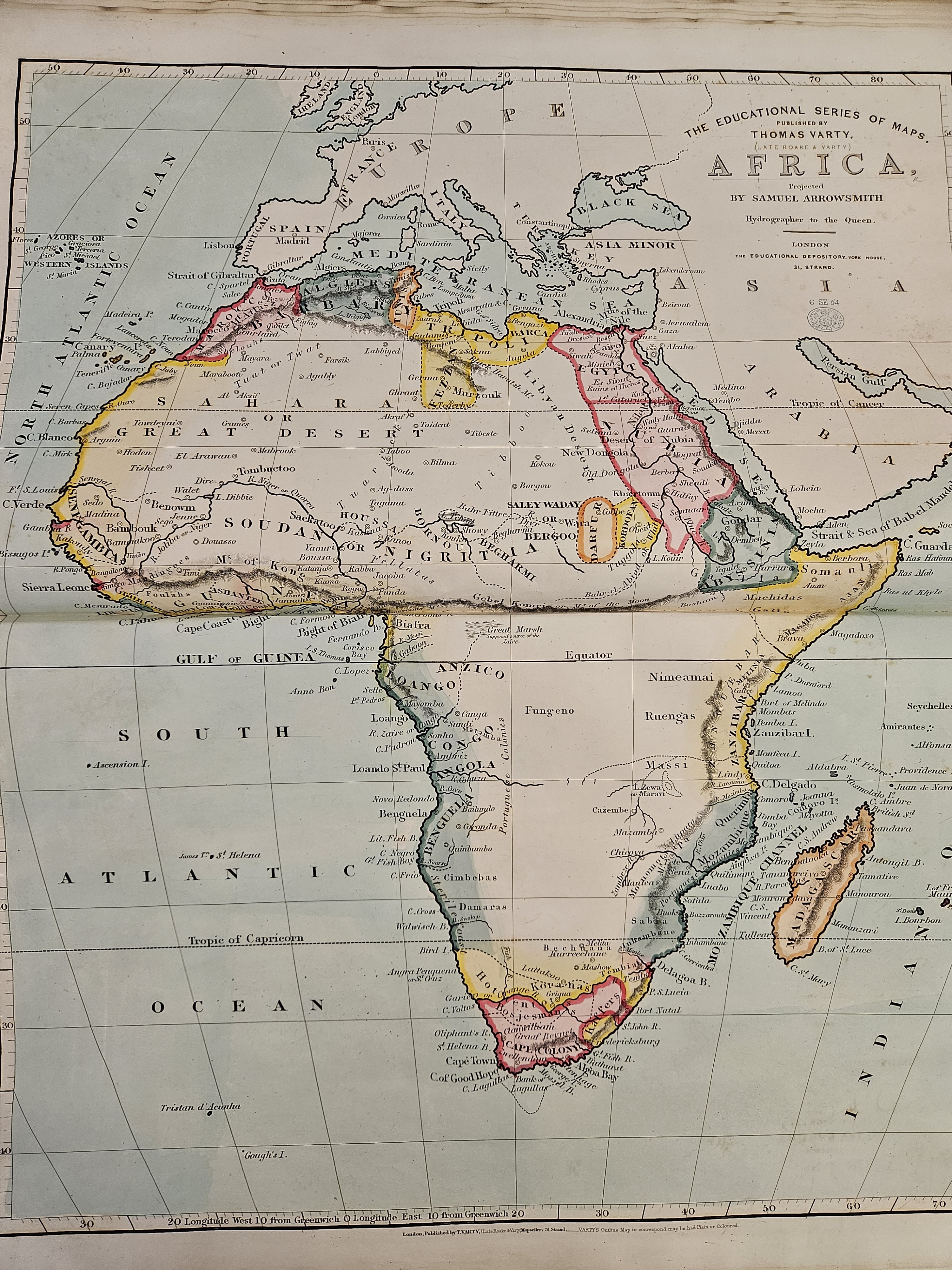
On the other hand, and from this same British perspective, India (or rather “Hindoostan”) is populated with cities, rivers, provinces, railways, infrastructure etc. You map what you know, the British certainly knew India at this time, and and Mercator was the container for that knowledge.
Equal Earth certainly goes some way to addressing the historic visual imbalance this created. However, and I will no doubt not be the only person to point out, it is not a “correct” or “accurate” visualisation, or even a “complete” one – no projection is. It is a set of mathematical abstractions and compromises which renders visible what is otherwise too huge to be visible. In that process, some combination of data – be it angles, surface area or symbology – will always be compromised. While the UN vote re-surfaces this debate and brings the matter back to public attention, Equal Earth is certainly not a panacea — a fact fully recognised by the authors of the paper in which it was originally proposed[1].
As with most things, the digital age has forced a further rethink, and on this I have one small quibble with the Equal Earth paper. In it, the authors state that web maps “are not designed to visualize the entire globe”. Well – in theory they are. The whole thing about web maps is that technically they place the entire globe in your pocket, allowing you to navigate, zoom, search and capture any piece of data pinned to any point on the earth’s surface using the Mercator supported referencing system that most of the big web maps (Google, Bing, Microsoft etc) use. It would be more accurate, I think, to say that the World Wide Web itself was not designed to visualise the globe, it was designed to link pieces of data together in a recognisable and navigable way. The Mercator projection was designed to link places together in a recognisable and navigable way – in the latter case quite literarily. In a digital world where places become data, it is easy to see the parallel. We have just plonked Mercator’s visualisation on top of our data systems out of pure convenience, just as the Victorians did when they were mapping the Empires of the nineteenth century. Mercator allowed you to navigate a journey from A to B, and the visualisation was only ever a secondary consideration to that task. Yet it came to condition the (visual) world view of millions, and to create international and intercontinental visual biases. Thanks to our insatiable desire for convenience, the WWW turbo charged these biases, and the UN has only just moved towards correcting them.
The moral of this story is that the idea that there can be only one form of map projection, whether that is Mercator, Equal Earth, Gall Peters, or any of the others, is not even a twentieth century idea, it is a nineteenth century one, or even earlier. Hopefully the UN vote will enable us to think more critically about what maps are for, how they relate to data, and whether the WWW, the defining infrastructure of the digital age, is really best served by a 450 year old map projection framework.
[1] Šavrič, B., Patterson, T. and Jenny, B., 2019. The equal earth map projection. International Journal of Geographical Information Science, 33(3), pp.454-465.


2 thoughts on “Projecting emotions: Mercator and Equal Earth”